ACTION PAINTING – JACKSON POLLOCK

Action painting is a style of painting in which paint is spontaneously dribbled, splashed or smeared onto the canvas, rather than being carefully applied with a brush. The resulting work often emphasizes the physical act of painting itself as an essential aspect of the finished work. Action painting is inextricably linked to the Abstract Expressionism art movement.

Source: Boundless. “Jackson Pollock and Action Painting.” Boundless Art History. Boundless, 21 Jul. 2015. Retrieved 03 Jan. 2016 from https://www.boundless.com/art-history/textbooks/boundless-art-history-textbook/europe-and-america-from-1900-1950-ce-36/abstract-expressionism-230/jackson-pollock-and-action-painting-821-3536/

JACKSON POLLOCK.jpg

“My painting does not come from the easel. I prefer to tack the unstretched canvas to the hard wall or the floor. I need the resistance of a hard surface. On the floor I am more at ease. I feel nearer, more part of the painting, since this way I can walk around it, work from the four sides, and literally be in the painting.” JACKSON POLLOCK

ACTION PAINTING – PORTRAIT

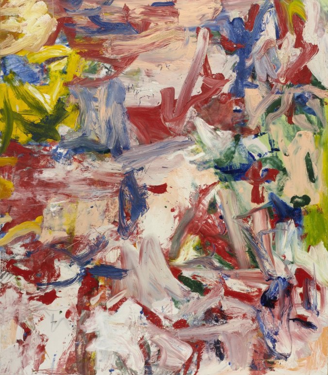
ACRYLIC PAINT, PVA GLUE, WATER ON BOARD
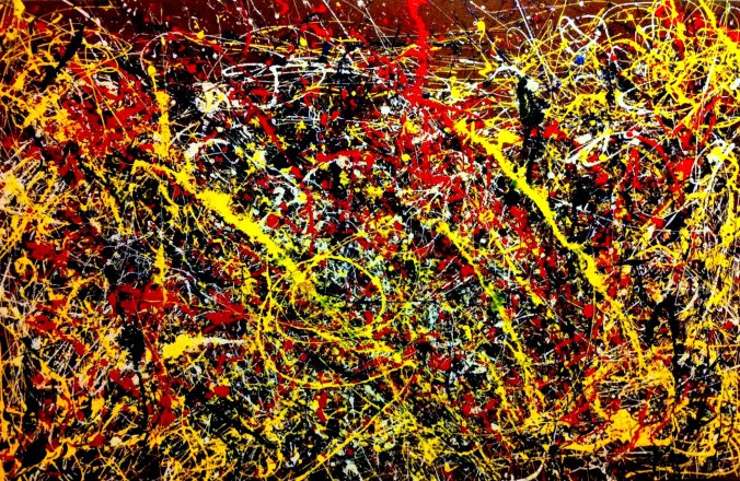
I have stepped away from my comfort zone where I was able to be in control. I decided to go large and construct a portrait, which was less controlled. By using sauce bottles, acrylic paint, PVA glue and water I created this final piece. I am exceedingly ecstatic with the result, as this was somewhat innovative to me. The oozing of paint gives a physical ambiance to the portrait and conveys the emotions alive. I used primary colours to generate this portrait, which restricted my palette, making me think about colour positioning. I really like how the layering of the paint runs into one another to build a secondary colour – the colours and textures created are stimulating and experimental.

I worked on this portrait from overhead and then dripped the paint; this allowed accidents to happen and attention-grabbing trails to appear. The process was uncontrollable which allowed me to go wild and experiment with lines and colour rather than worrying about the end resemblance.

EXPERIMENTING – PAINTING AND PHOTOSHOP

Using the colour wheel, I came up with the colour composition of this watercolour portrait. I was experimenting with ways in which I could use watercolour paints (mixing colours, block colours, transparency etc.) I then experimented further with this painting through Photoshop. I trialed with the contrast and colour of the image to generate a new colour palette to take forth into the large painting.


WATERCOLOUR PORTRAITS

EXHIBITION 3.1

WATERCOLOUR PORTRAITS – FINAL EXHIBITED OUTCOMES

Influence by the artist Michael Murphy and his map like portraits, I created my own outcomes, but instead of layering cardboard on top of each other, I concentrated on the lines and shapes to make facial resemblances. I am extremely interested in the visual outcomes of these portraits and would like to take this idea forward. I have chosen different colours for the different portraits. The colours have come from my interest of the primary colours, secondary colours and complementary colours. I am very interested in the colour wheele and the different outcomes of colour. I would also like to pursue this idea of colour theory in the next project (studio 3.2). Having looked at several artists such as; Chuck Close, Chantal Joffe, Christina Troufa; I have found that I have a great interest in the colour palette area.

ARTIST RESEARCH – MICHAEL MURPHY – LAYERING

Electoral Divide

Portrait of Barack Obama the American President commissioned by Time Magazine for the 2012 Person of the Year issue. – See more at: http://www.mmike.com/2012.html#sthash.l0sOQtOS.dpuf

I am more captivated in the layering of the portrait rather than the sculptured portrait. I find the layers of colours make attention-grabbing spaces and emphasises my attention on the forms built. The shapes which have been created to show the different tones and shadows on the face have a map like feel to the outcome. When analysing the sculpture, I can see more geometrical transformations happening. I really like the idea of a portrait made up of mapped out lines, building upon contrasting colours. This idea I will take forth in my watercolour portraits.

ARTIST RESEARCH – CHUCK CLOSE – ABSTRACTION AND COLOUR

‘Alex II’ with close-up detail (1989) Oil on canvas (36″x30″)

CHUCK CLOSE
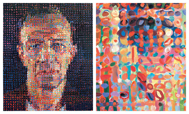
http://www.artyfactory.com/art_appreciation/portraits/chuck_close.html

The large scale painting is taken from a black and white Polaroid photograph. Chuck Close’s brushwork is less constrained by a grid outline, making abstracted pieces upfront but when analysed from at a distance turning the abstraction into a photographic projection. There are conflicting emotions that occurs through Close’s paintings which is reflected by the strong use of complementary hues. The colour palettes are subjective.

I was initially intrigued by the bold colour palette that Close uses. The colours are energetic and visually pleasing. This idea of producing energetic portraits through lively colours interests me greatly and I want to pursue this idea forth to create emotion and energy through my paintings; giving the subject personality to engage with as the viewer.

THEME – PORTRAITURE AND BEAUTY

My interests lay within portraiture and beauty. Basing my theme on beauty through portraiture, I will show how beauty is perceived through the eye of the beholder, as beauty is portrayed in countless ways depending on the individual. I am particularly interested in ruptured beauty, showing how the ideal beauty could be pushed to the extremes.

PERCEIVE – interpret or regard (someone or something).